The art of visual communication isn't something that can be expected to be mastered overnight. I have been experimenting with visualization for years and continue to learn things almost daily. Graphics will eventually become a part of muscle memory and is vastly improved as one's visual library is expanded. Just as a weight lifter lifts to improve strength, the illustrator's job is no different. You can not expect to improve if you aren't practicing, and practicing often!
It is important to be self critical, especially to the point where you can critique your own work at whatever level you may be at; whether that is a beginner, amateur, or professional level. These days, almost anyone can generate renderings from programs, some may even effectively use Photoshop as a means of enhancing them. Others prefer traditional methods of illustration like markers, pen and ink, or paint. No matter what the medium is, when rendering for realism, there are a few rules to follow. Some would call them simple, but the reality is, if they were simple, everyone would be a great illustrator. There are no shortcuts to becoming good, but you can at least change the way you think and approach visualization.
So what skills do professionals have that amateurs do not? What can the average artist do to improve their illustrations? The ideal workflow would be to effectively draw, and render in real time, without the use of any rendering programs whatsoever. By understanding a few basic components of how we see the world and more importantly how we embed that into our illustrations, we can actually create better images, faster! The core of graphic foundations can be extracted from artists, photography, drawings, or paintings; and most importantly observing the world around us. These concepts may seem elementary, but they are the largest barriers keeping an image from looking amateurish, rather than professional. The following list is only the tip of the iceberg, but is a prerequisite for producing a professional output.
- Value
- Textures
- Light sources
- Color theory
- Camera lens, scene, and atmospheric perspective
- Composition
VALUE
Value is on the top of the list is for a few reasons. 1) Our eyes see value in very high resolution. We can decipher even the slightest value shifts, and our brain can communicate that into three dimensional understanding of spaces. 2) Every good photograph, painting, rendering has a well balanced value scale. Thinking in black and white is key to getting the image to "feel" realistic. 3) It is the foundation of being able to communicate about an image and the elements within it. If you can not talk value, or you do not understand value, it is very hard to correct it.
- Resolution of value compared to color - Resolution? What does that even mean in this context? Look at the image above. We can see from white to black in a gradient that is very smooth and continuous. Our eyes can even break it down into very clear sections (1-10), and even beyond that into levels of (.1-.9) within each sub group, and so on. Color is much different. Our eyes see very low resolution, which means its harder for our eyes to see the difference one color to another. Value is what separates elements and allows us to see edges, depth, and light, not color. More on color later.
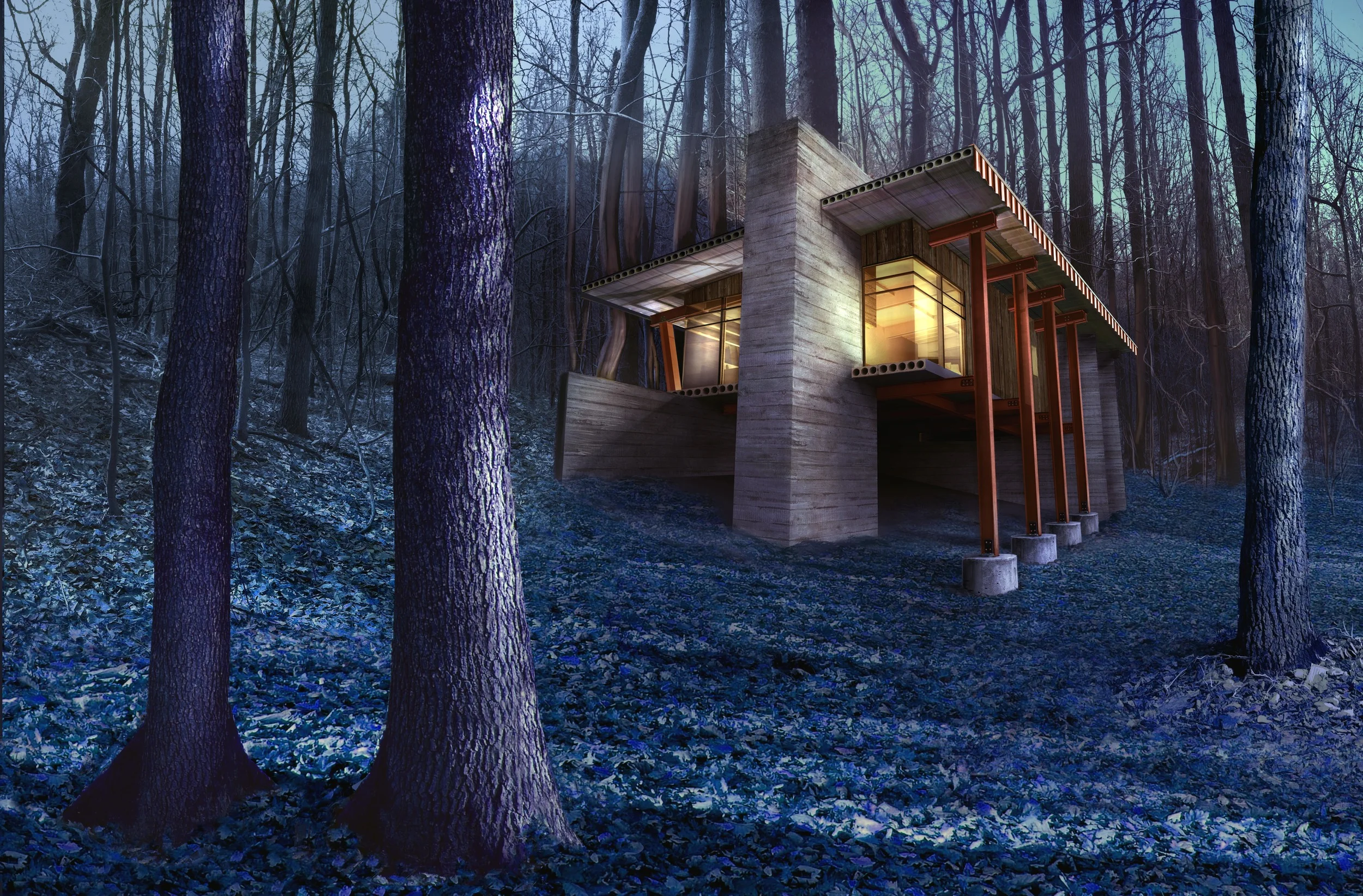
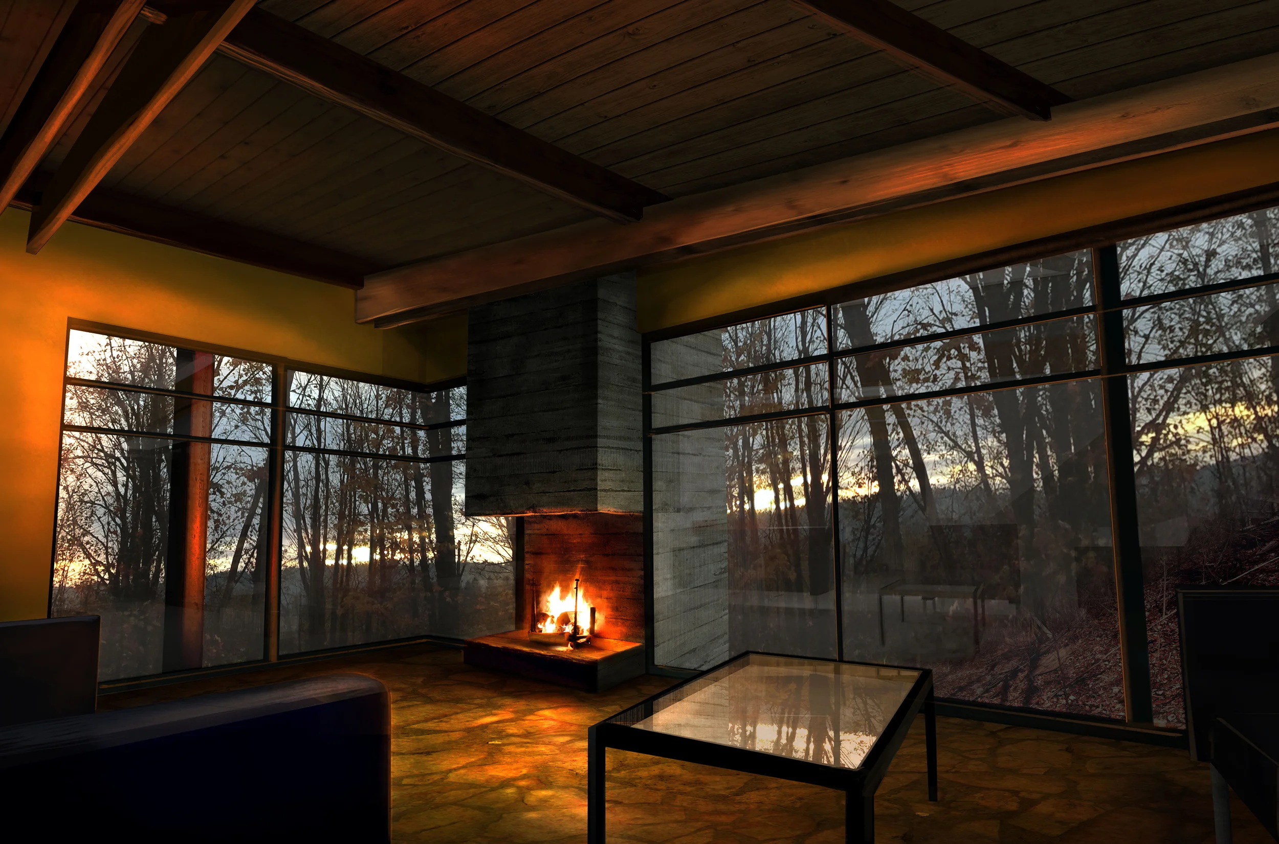
- Determine overall value shift - Any image you will ever see, any picture you ever take, any drawing you ever create will have a value shift that fits into 1 of 3 "keys". I think inherently a person will tend to always gravitate to a particular key. I tend to lean towards a mid to low key, I am usually very careful about using too much white, I really think it can be the biggest killer of nice images. The reason isn't actually the use of white, rather the amount of white in say a mid key image. If the ratios of white are too high, the image will feel washed out, and artificial. There may not be a right or wrong "key", but it is something to make sure you are aware of when starting an image.
- Images should “swim” - Such a subtle aspect to consider but one of the largest that I notice people neglecting. Value gradients should flow and contrast to elements that touch them. This really becomes how our eyes perceive depth and separate the pieces of the image. A mistake I see often are where objects touch the sky. If the sky in an image is too close to the building's value, the depth of the image is ruined. This idea gets much more complicated than how I describe it, however it is important to have at least 3 separate value shifts in a well rounded value composition.
- NEVER use pure whites, or pure blacks in a solid state.
· Texture
o Resolution differences
o Entourage differences
o Too much texture & detail
o Not enough texture & detail
consistency of style
· Color theory
o Saturation, hue, value
o Color arrangements
· Composition
o Selling point
o Scene (BACKGROUND, MIDDLE GROUND, FOREGROUND)
o 1,2,3 water bucket
o Eye floating off the page
· Perspective
o What camera lens are you using?
· Lighting
o Primary?
o Secondary?
Rendering pipeline
o Idea
o Design
o Refine/set up
1. Image construction
2. Thumbnails / compositions
3. Image references (scene and composition)
o Model
o Render
o Post process
4. Image layers (1,2,3)
5. Image references (color, setting, mood)
o Output
Where is the strength of the image? What is the selling point? Is this angular, or elevational?
· Horizon-line
1. Worms eye
2. Human eye
3. Mid level
4. Birds eye
· Composition
· Reference Images based on scene and composition.
Key points to dissecting of an image.
o Understanding camera lenses
o 1 point
o 2 point
o 3 point
o Curved perspective
o Finding the horizon line and vanishing points.
o Multiple sets of points in image
o Understand layers of an image
o Use painting as a reference
o Back ground, middle ground, foreground