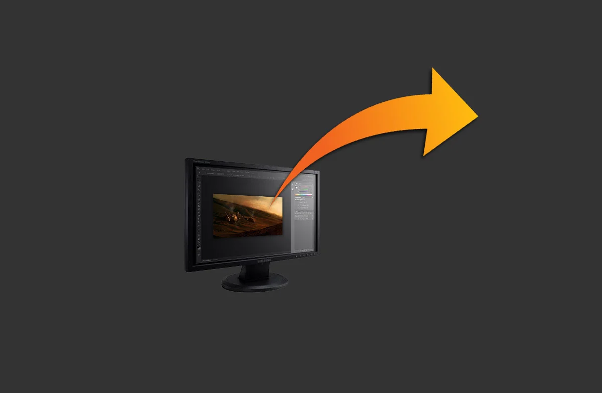
I can remember back to some of my earliest renderings, being so proud of the images I had just made. I had intended on printing out a nice little mini portfolio of them to get ahead of the portfolio game a bit. It was disappointing to find the images and text so pixelated that it was hard to read. I was never taught how to set up an image, so I just used default standards. I didn't know the true size, pixel size, resolution, or anything of what I was working in. This thread is just the basics, but it should be helpful for someone just starting out, to ensure that you get the quality of image you want!
Remember, these steps are part of my methodology. I always encourage students to find whatever work flow might work for them. Try to look at the concept and workflow of what I am doing, and emulate that within your own programs or software.
Workflow and Overview
- Consider your output
- Set up your canvas
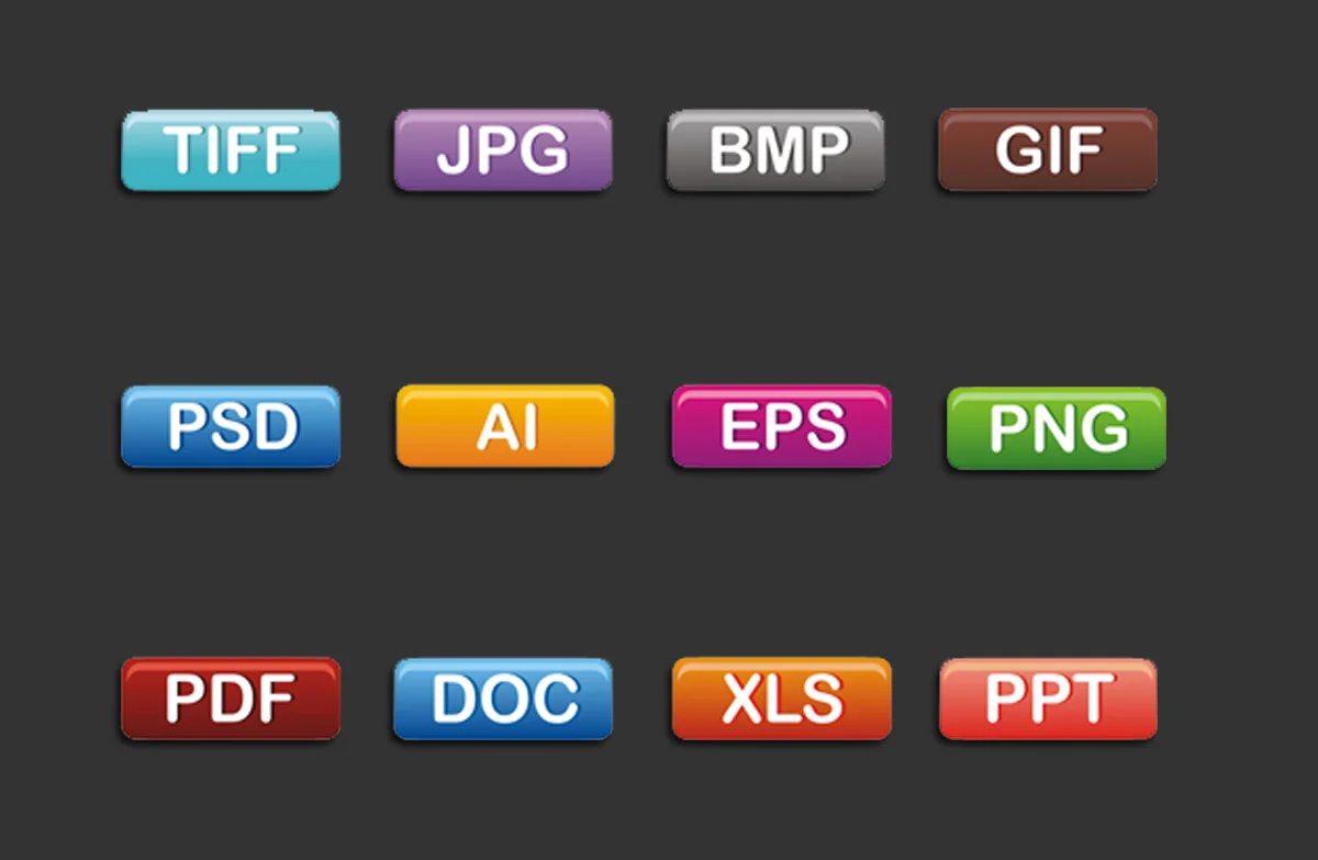
- Export
Consider your output
Consider what you are going to print. Depending on the type of industry you are in, your output may vary, and quite a bit. Typically in the profession of architecture, it is very common to print things out on 11x17 to work at. It is a large enough size to draw at a decent scale, and it's a typical size to have for an office printer. You may use 8.5x11 but typically only for really quick printouts or word documents. Sometimes, portfolios may be even smaller, which means it is crucial to begin considering text and image resolution. On the more rare occasion you may have to create large format boards or banner presentations. These are on the complete opposite end of the spectrum. So where do you start?
Consider who is viewing your work. Who is going to be looking at it? Will they be reading it? Will they hold it in their hands? Will they view it on a computer screen? Will they view it on a mobile device? Will they see it from 10 feet away? Will it be on a projector? All of these are great questions to ask yourself before you even get started. So here are a few rules of thumb for moving forward.
Set up your canvas
- Held in hand?
- Format to true size (8.5x11 or 11x17)
- High resolution (250 dpi minimum)
- Text size: normal page font (12 pt)
- Online viewing, website, or digital?
- Format to aspect ratio (1600 x 1200 or comparable)
- Low resolution (72 dpi is typically all the monitors can view) (150 if application can zoom)
- Text size: normal font (12 pt)
- Print out to be hung on a wall?
- Format to true size (8.5x11 or 11x17 or 18x24 or larger)
- High resolution (250 dpi is typically what plotters max out at)
- Text size: normal font (12 pt), titles can be larger (16-20 pt)
- Print out for banner or larger format?
- Work in rule of ratio. If the output size needs to be 10'x5', make the document comparably scaled down. For instance 24"x12".
- Very important to then scale the resolution by the same factor. If you want the output resolution of the 10'x5' to be 100 dpi, you need to multiply your smaller document by 5 as well, making it 500 dpi. This saves file size and makes it easier to work within your document.
- Text size:
- Main titles can be large (50-100 pt)
- Subtitles can be large (20-30 pt)
- Notes and writing should be normal to medium size (12-20 pt)
Page margins
Margins can sometimes be an office standard, but I prefer to use common sense. This outline will help you understand a basic methodology when considering how to set up your page. Whether it is a portfolio page, small format pin-up, or a large format board, each needs to have an understanding of margins to ensure appropriate output.
Both large and small formats have similarities when setting up. I will outline both separately so as not to confuse. These also deal heavily with your own personal sizes and whatever plotters you may have access to. I am using arbitrary numbers to illustrate the idea.
Large Board formats
- Look to see the plotters capabilities and work within that. Too often, people pick an arbitrary dimension to print without even knowing what they can print. For the sake of the demonstration, we will use a plotter with a print width of 42", which is pretty typical.
- Work backwards. Set the 42" mark as your width of the document and make it whatever length you wish. I try not to print any longer than the width most of the time due to printer or computer errors, and most time it is not necessary. Let's say we want the document length to be 24".
- Now that you have the parameters set, you can set up your sheet size. You know the maximum size you can be is 42"x24".
- Next, layout some margins. These are extremely important. Most large printers margins are set to 0.5" per side. I like to use 0.75" to be safe . So we know that if we subtract our margins, we have a workable area of 40.5"x22.5".
- Finally, think about a reasonable text margin. You don't want text to close to the edge or it may get cut off. I try to use a standard 1-2 inch text margin to give plenty of breathing room for the eye, but use whatever you feel is appropriate.
Portfolio format
- Determine your output size. This can be any size unless you want a full bleed image, where as you want to make sure your image is smaller than the paper size. Printers cannot print completely to the edge of an 8.5x11 or 11x17.
- Let's use 8"x6", and work forward. We know it will fit within an 8.5x11 sheet of paper. Set up a document for an 8.5"x11" format. We want to also make sure this image is centered so that if we are printing front and back, the images will line up properly. The 8"x6" dimension needs centered on both axes.
- For the sake of this demo, we will assume a full bleed print, so I will want to add a bleed margin, so that the image can be printed, and then cut so as to not leave any traces of white border. Usually 0.125" is a safe, small number. Our workable area is now 8.25"x6.25".
- Work backwards now. We need two sets of margins, one for the binder edge and the other for text. I usually prefer 0.75" margin for the binder edge and 0.25" for the text margins. Again, these are critical to make sure things breathe well, and do not get cut off, or clipped in the binding.
- Also important, remember to add tick marks off of the image page so as to be able to line up for the cutter to ensure a nice, straight cut. This saves a lot of hassle when it comes time to assemble.